Ah, the timeless struggle of staring blankly at a paint swatch the size of a credit card, then imagining it spread across your entire living room wall. It’s like looking at a menu with a thousand dishes and deciding what you want based on the size of a single grain of rice. But fear not, dear reader! Today, I present to you the utterly not-confusing-at-all guide to picking the perfect paint color for your home. Let’s dive in!
1. Trust Your Gut (or Don’t… What Do I Know?)
We all have those moments where we trust our intuition and just know what’s right. Like when you chose those neon-green shoes that you wore… once. When it comes to paint, if your gut is telling you “hot pink” for the kitchen, who are we to argue? Just remember: you’ll be looking at that color every day, probably multiple times a day, unless you fancy eating out for the rest of your life.
2. Play ‘Spin the Color Wheel’
Remember the color wheel from grade school? Yes, the same one where everything seemed so straightforward. Now, it’s your secret weapon in mastering the art of color coordination. Or, at the very least, it can be a fun game when you’re at your wit’s end. Just take a spin, and wherever your finger lands, that’s your next room color! Blue toilet? Red ceiling? The world’s your oyster!
3. Sample, Sample, Sample! (Did I Mention Sample?)
Paint samples are like those tiny cups of yogurt they hand out at supermarkets. You love the two bites you get, but will you really enjoy a whole tub of it? Buy those tiny cans of paint, and daub a bit of each on your wall. Sure, your wall may look like a rejected modern art project for a while, but at least you’ll know what you’re getting into. Or, you’ll realize you have an uncanny knack for choosing every wrong shade in existence.
4. Ask Everyone You Know (Including That Random Stranger at the Store)
Post photos of your sample splotches on every social media platform you know. Ask for opinions. The more conflicting, the better! Your Aunt Linda will undoubtedly remember the lime green color she painted her bedroom in the ’70s and swear it’s the best choice. Meanwhile, a random commenter from halfway across the world might pitch neon orange. But who knows? Maybe they’re onto something.
5. Determine Your Room’s “Mood” (No, Rooms Don’t Have Feelings. Or Do They?)
What feeling do you want your room to evoke? Calm? Drama? Utter confusion? Once you decide on the mood, picking a color becomes… well, only slightly easier. A soft lavender might be soothing in the bedroom, but if you’re going for “vampire lair,” then maybe opt for blood red.
6. Seek Inspiration from Nature (or the Inside of Your Fridge)
Ever watched a sunset and thought, “Oh, that’s the exact shade I want for my reading nook!”? No? Just me then? Regardless, nature is chock-full of vibrant colors and delightful combinations. You might find the hue you’re looking for in the petals of a flower, the ripples of a lake, or even inside a moldy cheese sandwich from the back of your fridge. Now there’s a story for guests: “I got my wall color from expired dairy.”
7. Consider Your Lighting (Because Shadows are Sneaky Little Critters)
That buttery yellow that looks fabulous in the store might turn into a weird shade of sallow green under your home’s lighting. Don’t let those sneaky shadows deceive you. Test the paint in different light settings: daylight, dusk, and “I’ve been binge-watching my favorite show and didn’t notice it got dark” kind of night.
8. Ponder Your Furniture (Because Clashing is Only Cool in Fashion)
Got a neon green sofa? Maybe skip the fire-engine red walls. Unless, of course, you’re shooting for that avant-garde Christmas all year round vibe. Remember, your furniture and decor play a major role in the overall aesthetic. Your paint should be the backdrop, not a scene stealer.
9. Visit Haunted Houses (or Just Regular Old Ones)
Sometimes, the best inspiration comes from the past. And no, I don’t mean that time you tried to highlight your hair and ended up looking like a zebra. I mean classic, vintage colors. Visit some older homes or mansions (haunted or otherwise). Who knows? You might find that Victorian mauve is just the ticket. Plus, if it’s haunted, you’ll get a good story AND a color idea!
10. Embrace the Fails (They’re Just Future Stories)
Painted your room and hate it? Well, welcome to a new adventure called repainting! Don’t fret too much about getting it wrong. At worst, it’s just another afternoon applying a new color while belting out your favorite tunes. And later, you’ll have an epic “Remember when our living room was neon?” story.
In conclusion, choosing the right paint color for your home is a journey. It might be filled with color swatches, odd glances from hardware store employees, and maybe a few moments of doubt. But remember, every shade you choose, whether a hit or miss, adds another brushstroke to the masterpiece that is your life (and living room).
Happy painting, and may your walls forever be your canvas!
Bonus Pro Tips: The (Not So) Secret Design Rules for Room Colors
Because we know how much you love rules (and because nobody wants their bedroom looking like a circus tent), here’s a handy breakdown of design color basics for each room:
1. Living Room:
- Pro Tip: Earthy and neutral tones create a welcoming atmosphere. Think beiges, soft grays, or subtle blues. You want the space to invite conversation, not scream, “Look at me!”
- Common Design Rule: Allow your furnishings and decor to add pops of color. The walls should set the stage, not steal the show.
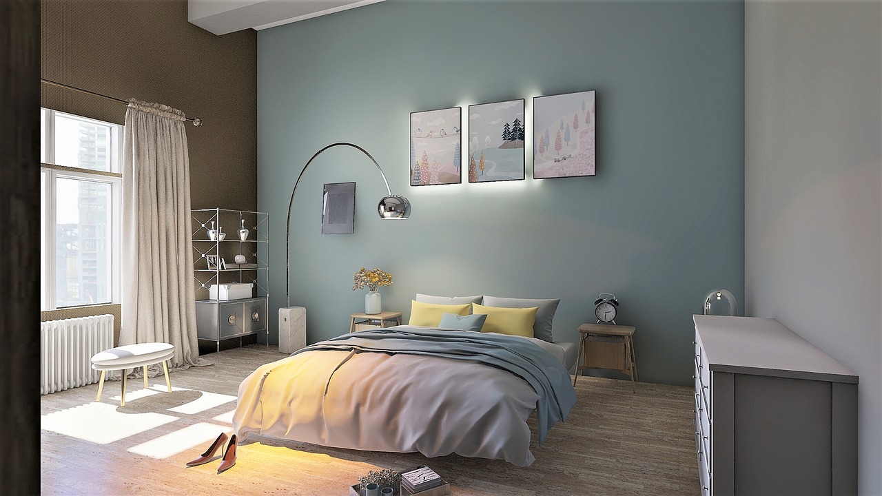
2. Bedroom:
- Pro Tip: Cool colors such as soft blues, lavenders, and greens promote relaxation.
- Common Design Rule: Go for colors that evoke tranquility and calmness. This isn’t the place for electric neon or eye-popping patterns (unless insomnia is your thing).
3. Kitchen:
- Pro Tip: Warm hues like yellows, oranges, or even light reds can stimulate appetite and create a cozy environment.
- Common Design Rule: Keep it bright and airy. Dark colors can make the kitchen feel small, and unless you want your culinary space to resemble a shoebox, it’s best to stick to the lighter side.
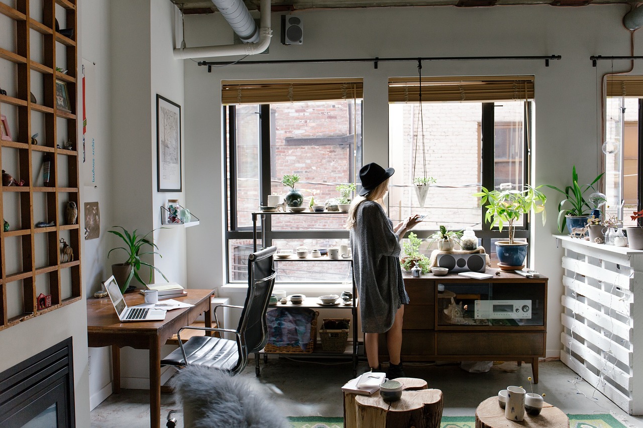
4. Home Office:
- Pro Tip: Green is known to boost productivity. And no, not the glow of the exit sign after a tough day – think soft sage or pale mint.
- Common Design Rule: Avoid overly vibrant colors that can be distracting. You want a shade that keeps you awake, but not one that sends you into a hyper-visual overdrive.
5. Bathroom:
- Pro Tip: Cool, light colors can make a small bathroom look more spacious. Consider sea blues or light aqua.
- Common Design Rule: Whatever color you choose, make sure it can stand up to the steam and splashes. This isn’t the place for matte finishes unless you’re a fan of the “damp patch” aesthetic.
6. Dining Room:
- Pro Tip: Rich, deep colors can add an element of sophistication. Imagine a deep burgundy or a forest green.
- Common Design Rule: Opt for colors that complement your dinnerware. Unless you want to play “Where’s Waldo?” with your plates.
There you have it, dear reader. Dive into the colorful journey of home painting with these pro tips in your toolkit. And if all else fails, remember, paint can always be painted over. It’s like life’s little undo button.